
DOH has new visualization standards for agency data dashboards
Consistent style and branding of agency data dashboards is important to help audiences easily and efficiently find the information they need. To achieve this aim, DOH developed an agencywide Style Guide for Data Dashboards.
The goal of the new style guide is to share visualization best practices with dashboard developers so they may build user-friendly, intuitive, and accessible dashboard and visualization products regardless of the visualization software used. We are sharing this resource with you to help answer any questions you may have about dashboard accessibility best practices.
To focus on better communication through data visualizations and demonstrate design strategies, the style guide addresses all the parts of dashboard layout —including graphs, charts, and tables. Elements such as page layout, font, and color are all choices that determine whether a dashboard is clear, engaging, consistent, and accessible or not.
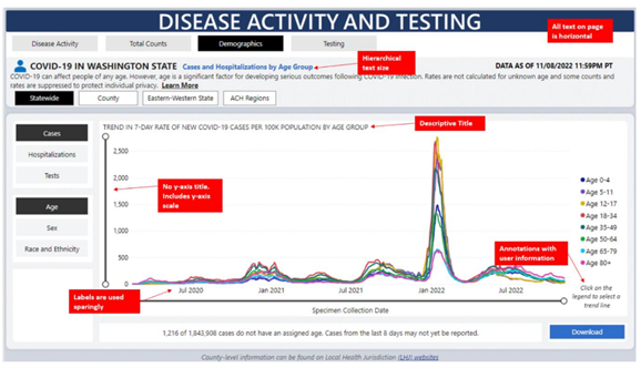
Example from the guide:
The guide brings together communication and data visualization lessons learned during the COVID-19 response, as well as subsequent agency dashboards under the Data Modernization Initiative and our own data visualization accessibility standards. By promoting transparent data products and leveraging technologies used during the COVID-19 pandemic, it also aligns with DOH’s priorities in the Transformational Plan.
The guide was developed as part of a collaboration between DOH’s Data Visualization team, Washington Tracking Network, and Office of Public Affairs and Equity. Email the DOH Data Visualization team with any questions you may have about the style guide or examples of data dashboards built with this style guide in mind.